Anyone using Chromium, the open-source base that underpins Google Chrome, will soon notice something different: a brand new icon.
The newly revamped Chromium logo is already in use in the latest developer build of the open-source browser, where it’s displayed on the ‘settings > about’ page.
It’s an obvious design evolution that, like Google Chrome’s new icon, introduces a flatter, brighter and more ‘Material Design’ appearance. The gradients are toned down and the color is ramped up but it’s still recognizably the Chromium icon.
Chromium’s new icon has not yet been set as the application icon (the one you click to open the app) but it – excusing any last minute decision – will be in the near future.
‘Why is this news?’ is what a lot of you are probably asking. And that’s fair. After all, this is a passive change, not an interactive one.
But even so, design tweaks, however inconsequential in silo, are worth noting. If for the reason that subtle tweaks to the look of software used daily gets hard to notice as the branding becomes second-nature and we become blind through utility.
That point leads us neatly on to the new icon for Google Chrome. This icon is one you’ve probably already seen but not consciously noticed.
Google Chrome’s New Icon
 A ‘material design’ icon for Google Chrome is on the way. In fact, it’s already ‘out there’ online, and already used by Google Chrome for Android.
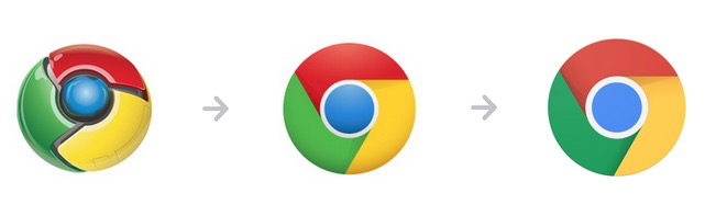
Unlike the changes in the new Chromium icon the changes in the new Chrome icon are less apparent. You can see a rough transition between old and new Google Chrome logo in the following gif. Eagle-eyed spotters will notice a few differences between the current and proposed material icon, including:
- Flatter appearance with different colours
- Segment shadows now tuck under the fold, not extend outside it
- White inner ring is thicker
- Inner blue dot is lighter, no inset shadow, no gradient
- The top down lighting/glow has been switched off
- Swirl segments are ‘tighter’
Design Changes Are Important to Note, Even if You Don’t Care
No matter how trivial or minor, any design tweak in a piece ‘user critical’ software like Google Chrome is not done lightly, doubly so when the “brand” is involved. As with the new Chrome Web Store Icon, the changes made are done intentionally, with a specific purpose, aim or goal in mind.
Subtle icon tweaks they are. But a change in branding often marks a deeper shift in overall thinking behind the product, one that will, inevitably, extend beyond it.
A new icon today, a new look tomorrow…