The Chrome team are once again toying with ideas to improve window controls in Chrome OS.
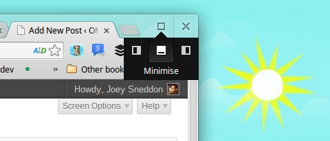
None of the proposed changes – emphasis on the proposed – are especially drastic. They build on the so-called ‘radial menu’ design already present in Chrome OS (see image at bottom of post) with the aimed at making controls easier to understand.
Version 1 of the proposed changes sees the ‘square’ control button replaced with a three dotted icon. Look familiar? If you’re an Android user it will. A vertical strip of three dots is used to denote ‘menu’ by Android following the introduction of its ‘Holo’ interface guidelines.

The drop-down revealed by clicking it is more ordered and menu like, and adds a shortcut for the Chrome OS ‘immersive’ mode to the list.
But the latest version tweaks things again – ditching the ‘X’ close button entirely for, what the designers refer to, as a more ‘minimal look’.
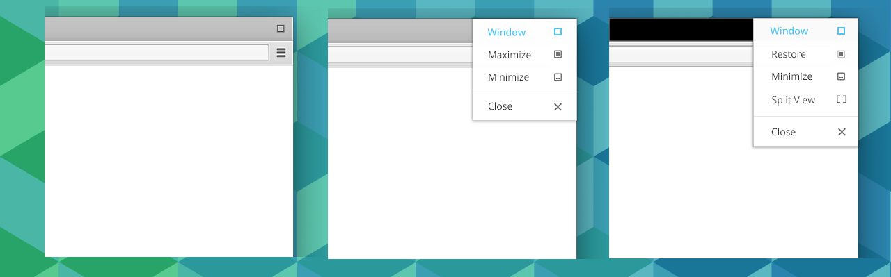
Losing the ‘x’ control will be a controversial move if accepted. The important thing to stress is that none of these changes are final, and none are likely to land before Chrome OS 28 – which isn’t due for release quite yet.
Like them? Loathe them? Let us know in the comments.