An all new beta release of Google Chrome for Android is now rolling out on the Play Store and you won’t fail to notice the changes.
Chrome 37 Beta is the first public release of the browser to feature Google’s new “Material Design” language, which was unveiled at Google I/O back in June.
The impression it makes is evident from the offset, both on mobile and tablet devices. The off white backgrounds and dialog elements have been replaced by clean whites, dialogs and buttons seem softer and more distinct, and there’s improved typography, spacing and layout throughout.

The changes are most apparent on mobile, where the old Chrome start up page now looks incredibly minimal. The URL bar has been combined with the new tab search box. Sitting in the centre of the screen, URLs and search terms can be entered, while scrolling the page up repositions the field into its more familiar position.

Entering an address or a search term into the box will expand it almost full-width. Autosuggestions flow in from beneath, with the drop shadow of the URL box clearly denoting which is the ‘active’ element on the page.
Frequent sites are still listed, while your mobile bookmarks and recent history are only a quick poke away.
On tablets the URL bar remains in place as normal, but features improved icons for back, forward, refresh, favourite and voice search. The URL box again appears slightly raised from the rest of the page to denote its prominence, while active tabs lose their harsh shadows for a lighter look.

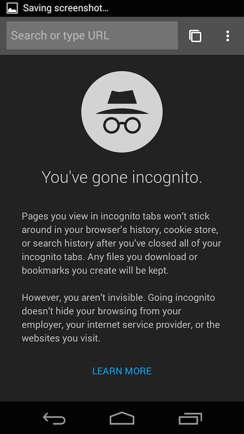
Incognito
One of the biggest beneficiaries of the material makeover are Incognito tabs. Using a darker theme to help differentiate them from regular browsing pages, Incognito browsing tabs now have new icons and bigger, brasher text introduction.
Tab Switching
Switching between open tabs in Chrome for Android remains familiar. Just tap the ‘tabs’ icon in the toolbar (visible at all times) to sift through cards of your active pages.
What’s different is the look of the cards (lighter headers, softer corners) and the animation used when closing one from the overview.
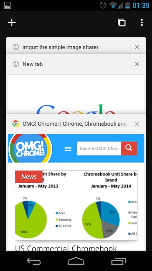
It’s hard to explain the difference without sounding like something written for a grade 8 poetry contest, but the swiping effect appears to move in a more 3D motion, moving backwards and out as opposed to the side tumble in stable builds.
Other Changes
A new lick of pixels is not the only notable change debuting in this beta. Google is touting the merits of a new “simplified sign-in” process that it says will take the frustration out of using their various websites and services in the browser.
In Chrome 37 beta for Android, when you’re signed into Chrome with your account you won’t need to sign in again when switching to Gmail, Google+, Maps or any other of Google service. And yes: it appears to support multi-profile users, too!
You can head on over to the Play Store to grab the Chrome Android beta for yourself. It’s free and runs alongside the regular version.
- Source: Google Chrome Blog