We’ve covered the experimental changes to YouTube the past few months, and as of yesterday, Google has started the process of rolling the new layout to all users.
Looking Fresh!
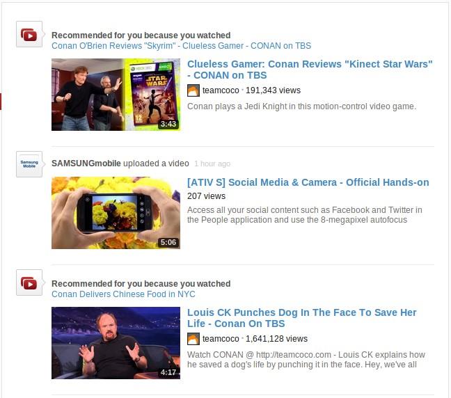
Sporting a sleek white look, the new interface makes videos in the stream really pop-out.
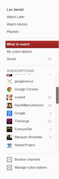
The new sidebar (or as Google wants us to call it, the “guide”) on the left hand-side makes it easy to view your subscriptions, view your social stream (your connections from Google+, Facebook, Twitter) and other tools.
YouTube+
The merging of Google products into Google+ is inevitable, and YouTube is not getting away. In the new and current YouTube design, it certainly feels like it has taken some cues from Google’s social service.
If you have upgraded your YouTube account to Google+, you will see the familiar notification counter and your profile picture displayed on the top right. Clicking on your profile picture displays a list of settings in two sections, with the left showing a list of YouTube related settings and on the right, settings related to your Google account.

New Player and The Guide
The new player in YouTube hasn’t changed in the way of features, but now sports a flatter and more modern look. Playlists now blend in with the player, and it works really well.
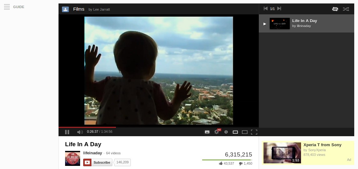
It may be hard to see from the screenshot, but the guide from the home stream will hide from view when watching a video. To bring is up, just click the button and it will slide into view. This helps keep the distraction to a minimum, allowing users to enjoy content without anything on the page trying to catch your eye.
The new-look is rolling out as I speak, so you should have it already, if you don’t then expect it sometime over the next few days.
Love it or hate it? Let us know in the comments..