YouTube, one of the most-visited video content sites in the world will soon be receiving a makeover, complete with a Google bar.
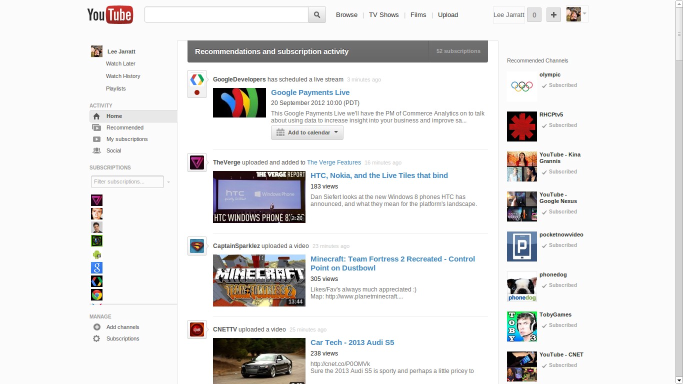
For many months now, Google have been experimenting with different user interface designs/layouts for YouTube, and rolling them out to a select number of users .i.e. guinea pigs.
There is a common theme in these designs, and that is that they resemble Google+, a lot:
Whilst looking at my stream on Google+ this morning, +Chand Hamal Thakuri had posted that an even more recent experimental design change for YouTube had rolled out to him.
What is really great about this version is that the video sharing site now sports a Google bar at the top, making YouTube more consistent with Google’s other products and services, and they are bound to get a lot more traffic due to this change.
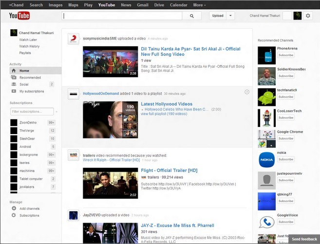
As well as tigher Google+ integration, you will see a new video counter for your subscriptions on the left-hand side, which I can imagine will be very useful.
Profile pictures/avatars will now appear next to users comments, making the system feel less cold. The thumbs up/down buttons look a little different also.
There are a plethora of new/refreshed features and UI refinements and it looks like Google seems to be almost ready with the new-look, and hopefully will be rolling out to everyone soon.
What do you think of the new look? Do you prefer this or the current design?