A number of small changes to the layout and functionality of the Chrome Web Store have gone live this evening, with a new ‘Support’ section being the most notable.
While far from being the sort of top-to-toe Material Design makeover many would like to see, the tweaks do help improve the overall usefulness and user experience of the apps and add-ons hub for both users and developers.
Below is a quick look at the most notable visual changes and additions.
Chrome Web Store Changes
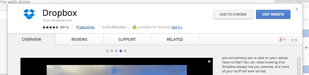
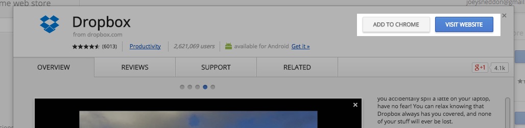
The dialog sheet for Hosted Apps — aka ‘glorified bookmarks’ — now shows a prominent ‘Visit Website‘ button in the info box strip. Interestingly the link away from the page is highlighted in the dominant blue color that Chrome App and extension listings use for the regular install/add to Chrome button.
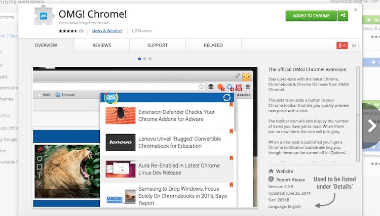
On the Overview page you’ll find that the salient information previously found in the ‘Details‘ tab — version, size, language, etc. — has been merged here.
The horizontal strip of ‘Related Apps‘ and ‘More from this developer‘ no longer appear beneath listings. Recommendations are now confined to the ‘Related’ tab.
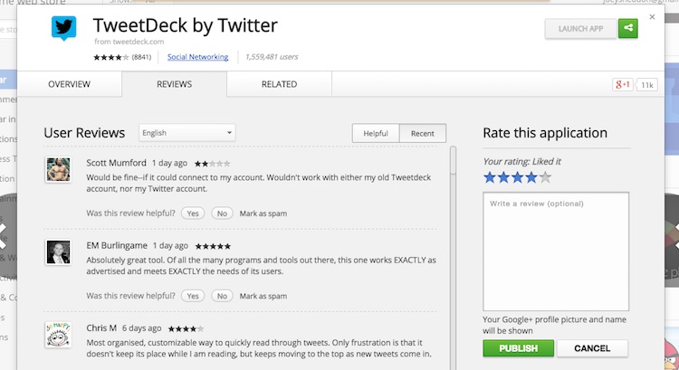
In the Reviews section the entry form has been shunted from left of the page to the right:
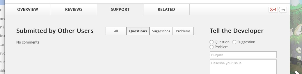
Headline change alert: a new ‘Support’ section has been added to the main sheet for Chrome Apps and extensions but not Hosted Apps. Here there are toggles for filing through questions, suggestions and problems submitted by other users.
To the right-hand side is an entry box with a few radio buttons that allows feedback/support issues to be logged quickly. Use of this feature requires (mercifully) a Google+ account.
Noticed any changes yourself? Why, let’s be hearing about them in the comments, then!