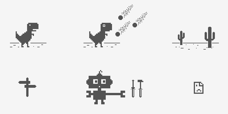
As a visual designer working on Google Chrome, Sebastien Gabriel is responsible for creating symbols that millions of users around the world see on a daily basis.
Many of Gabriel’s designs have become iconic in their own right, including the retro-styled ‘Lonely T-Rex‘ icon that appears to users when Chrome experiences network connectivity issues.
Today he agreed to give us a look into how those rich assets come to life.
Sebastien, who is also known as Kb, has been a Googler for just over two years. During his time at Google, Sebastien’s portfolio has grown to include icons that almost every Chrome user will recognize.
When Sebastien isn’t working on Chrome, he enjoys running, doing some old fashioned PC gaming, and releasing design freebies on his personal website. If you want to keep up with what Sebastien is working on (and let’s face it: you do) be sure to follow him over on Dribbble.
Could you tell us a little bit about what led you to become a Visual Designer for Chrome?
I was a visual designer for a French web agency and doing a bit [of] freelance. I was noticed by one of my current co-workers, contacted by Google right away and here I am.
It was a no brainer.
Some of the icons you are best known for are the “Lonely T-Rex” and the “Chrome Repair Bot”. What’s it like to design an icon which, ultimately, you hope most users will never actually see?

Designing an error icon is fun to do, it’s kind of like designing a 404. You hope the user will never see it but if they do, you try to make it as light as possible so you don’t add up to the frustration.
Google and Chrome as a brand have a good sense of humor. It’s the perfect place to be creative.
Your portfolio mentions that you work with the primary Chrome UI, helping to maintain a consistent experience across various platforms. What are the challenges that come along with that type of work?
Asset management and creation is a big one. Chrome is on almost all the imaginable platforms out there, all the form factors and on a huge amount of different DPIs.
A single asset such as the a Chrome tab can have up to 15 different variants if you include the platform differences, touch/non touch, iOS styling and DPIs and Android styling and DPIs.
On that same subject, when working with consistent experiences, how do you balance consistency within Chrome while also meeting design guidelines that are platform specific? Is there a formal process for making those calls, or is it left up to the designer/s working on that specific aspect of the UI?
‘We look at changes carefully to make the correct decision that will benefit the user experience’
This is not an easy task. Chrome is deeply bound to the OS it’s deployed on and the user is used to this particular OS and likes it. But at the same time, it’s important for Chrome to be recognizable everywhere.
Mobile or desktop OS, their style is evolving constantly along with their visual and interaction paradigms. The same goes for the Google brand and the Chrome brand. We try to find a good direction and look at changes carefully to make the correct decision that will benefit the user experience. Once this direction is found, we make calls on a feature basis.
When designing the Chrome for iOS icon (for version 29), you said that a primary objective was to bring the icon into unity with other Google product icons (Gmail, Hangouts, Drive). In your opinion, is is easier to work toward a matching theme like that, or do you prefer a fresh canvas when given a task?
It is easier to work toward matching theme I think. Although it is enjoyable as a designer to start with a fresh canvas, having brand consistency in this particular area was the good decision to make for this project. The Chrome brand and Google brand are recognizable and liked by users, it was important to carry that as clearly as possible.
You’re also responsible for the refreshed Camera App icon in Chrome OS, which you said was interesting because of the mix between flat and gradient styles. For the non-designers that may be reading this article, could you make an analogy as to what that was like?

We can put a lot of meaning behind what [is] flat or not. It seems like it is a pretty sensible subject for designers. What I meant was that the base of the camera is a simple color with no effect. I tried aligning the lens with this style but the depth simply wasn’t there so I added some gradient, shadowing and lightning effects in it, focusing all the depth on the lens part of the illustration which creates this duality.
Which Chrome icon did you have the most fun bringing to life?
For the error icons, I’d say the T-Rex. For Chrome OS icons I’d say the files app icon. I love this tint of blue and the transparent/floating effect on the folder.
Have you ever encountered “designer’s block” while working on an icon for Chrome? If so, what’s your ritual for overcoming it?
I do not think I ever really encountered “designer’s block” on an Chrome icon. But I encountered it in a lot of other places. I found that a good way to overcome it is to stop working on it, go do something else. Get some inspiration somewhere, on the web on in real life or simply go out and do something completely different.
You’re pretty active on Dribbble, often sharing your latest creations and engaging fellow designers. How much of a role do communities like Dribbble play in giving you inspiration / helping to improve your skills?
It played a huge role both for my skills, inspiration and career. Staying connected with your peers is key. Being aware of the trends and of the evolution of design is also extremely important.
‘Getting involved in these communities is a great way to improve your skills’
It could seem like it would force you to follow trends and make your design look like thousand of others but to be different, you need to understand what is the consensus.
I learned my Photoshop skills by digging through other designer’s .psd that they were nice enough to share, that’s why I keep doing this today with my freebies.
Getting involved in these communities is a great way to improve your skills by watching others and understand that a lot of people are better than you at what you do. Learn from them.
Regarding a career at Google, … be passionate about whatever you are doing.
Is there any advice you would offer to someone looking to pursue a career in graphic design, or even just a career at Google?
For someone who wants to pursue a career in visual and UI design, I’d repeat my previous answer, learn from others. Look up to whomever is better that you.
Regarding a career at Google, I’d say the first thing is to be passionate about whatever you are doing. Develop your skills, be nice, share with the web, do not rush anything and apply when you think you are ready.
