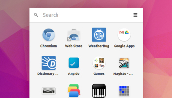
New look ‘folders’ are coming to the Chrome app launcher on Windows, Linux and Chrome OS.
A set of minor visual tweaks to the look of the folder icon in the App List were recently committed to code by Chromium developers.
The changes see the current light grey circle currently used made white, with a grey drop shadow added to give a raised, more pronounced appearance.
Though minor, the tweaks are designed to improve the overall look of folders in the list and will be applied to both the classic and experimental launchers.
Developers also say the change will roll out to “…the ‘All apps’ button on the experimental start page” — curious!
Expect to see the adjustment land in Canary builds on Windows in the next week or two, followed by a roll out to developer channels on Linux and Chrome OS thereafter. The Mac version of the app list doesn’t support folders.
Do you like the new look? Let us know in the comments. Personally, I’m still hoping they’re made to resemble Android’s ‘stacking’ layout, as in this mockup:
