If you’re on the beta or dev channels of Chrome OS then you might have noticed a less than transparent visual change: window headers for certain applications are no longer translucent.
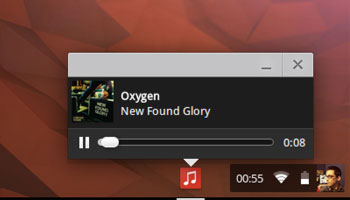
Until recently, the window header of a single, unminimised Chrome OS app would be rendered in a slick, Aero-esque see-through style, like so:

If more than one window was open the window headers would appear as a solid milky-grey colour:
While maximised windows would switch to a cool, ‘focus on the content’ black bar:
But transparency is no more. For undisclosed reasons (likely related to the refinement of window headers for packaged apps) all window frames, bar maximised ones, use a solid grey backing. Google has confirmed that this is an intentional change and not a bug.
Now, I’m not saying that these grey borders look bad. They don’t; they look okay. But that’s sort of the issue here: it’s just ‘okay’. Grey and white are used heavily in the Aura desktop UI, so the transparent flourish helped break up the look.
Admittedly, I use more than one app or window at a time, meaning most of the time I would be looking at solid grey headers anyway, so this is not — repeat, is not — an earth-shattering, enjoyment-wrecking change for me.
That said, the window frames were one of the most visually identifiable changes that arrived with the ‘new’ Chrome OS desktop a few years back so, out of nostalgia if nothing else, I’m a little sad to see them go.
- Source: Naukofox, Reddit