I’m going to wager that you’ve never paid too much attention to the default font used in Chrome OS. But get a good look while you can: it’s about to change.
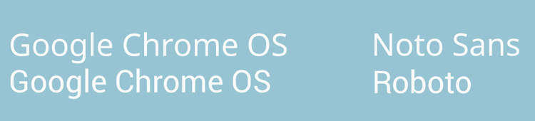
Roboto, Google’s custom sans-serif typeface that was designed (initially) for Android, will shortly replace Noto Sans UI as the default font in Chrome OS in English.
A request to add the font ‘and all weights’ has recently been lodged in the Chromium issue tracker by a Google design team member. The change will first be trialled behind a flag ignored to allow for any issues to be picked up on and ironed out.
Google describes Roboto as a “modern, yet approachable” font. It was designed in-house by Christian Robertson, whom trivia fans may know created an expanded version of the old Ubuntu logo font ‘ubuntu title’. Roboto debuted with Android 4.0 ‘Ice Cream Sandwich’.
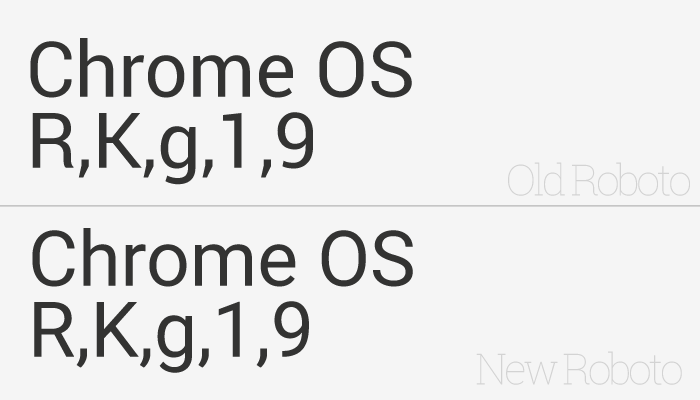
Roboto 2.0
For Android L Google has tweaked the appearance of many of the glyphs within the font. The refinements see it made “slightly wider and rounder, giving it greater clarity and making it more optimistic. […]”, Google explains on the Material Design Typography guide.
It’s this “newer” version of Roboto that Google intends to install as the default interface font in Chrome OS. Developers have pegged a tentative arrival with Chrome OS v41.