Just over a month after our report on the mysterious Project Athena the first working UI has been revealed – albeit in rough form.
Athena is a project bringing “a new kind of user experience” to Chrome OS, according to Googler François Beaufort. Indeed, all of the tickets we found in the Chromium issue tracker pointed to fairly radical changes in both the user interface and the fundamentals of the Chrome OS user experience.
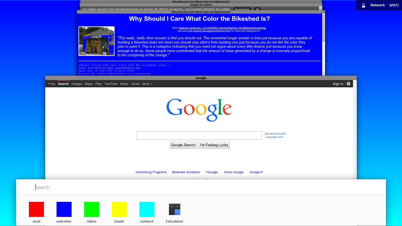
At the moment, the “first draft” of the UI has only basic window management, but we can already see some of the elements previously discussed in the screenshot above, including an app launcher, card-based window management, and the alarming lack of tabs.

The window management resembles the stacked tab interface seen in Chrome on phones and the recent apps list on Android devices. Similarities to Android are particularly interesting given that the L preview introduces a new activity model that makes Chrome tabs their own tasks in the Recents list. This could very well have the same reasoning as Athena dropping “tabbed content“.
The focus is now shifting away from the browser (or any app) to the individual tasks. As in the first draft of Athena’s UI, the focus is on the individual sites as points of entry for our various activities, not on Chrome as a window that contains several tabs for separate tasks we’re engaged in.
While it’s still a very rough work in progress, we’re starting to see more of the edge pieces of the Project Athena jigsaw puzzle fall into place. With Chrome OS getting some nice Android integration and the full-throttled move to Material Design, there’s a lot to look forward to as Athena takes shape.
- Source: François Beaufort