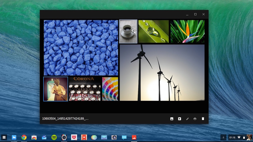
I do hope you’re not too attached to the crazy paving photo layout in the Chrome OS gallery app as, sob, it’s being removed.
“Mosaic View” (to give it its official name) lets you view photo thumbnails in a slightly more interesting way than the gridded view of the file manager. It is especially great for “zooming out” to get an overview of photos, and can be a fast way to locate that one eye-catching image within a crowded sea of many.
But, to quote one Chromium developer, Mosaic View is “a bit of a mess”.
The plan, listed on the Chromium Issue Tracker, is to remove the feature as soon as ‘…a better grid view’ lands in the Files.app. The only thing keeping the angularly adaptive grid from being given the ol’ heave ho right now is the impending Material Design makeover headed to Chrome’s core application set.
Press ‘M’ For Crazy
The mosaic view was introduced in 2012 as part of the big “Aura/Ash desktop” overhaul. Performance issues have blighted both the gallery and file manager applications for some time, with thumbnails of images slow to load, the editor causing badly optimised exports, and so on.
The upcoming Material redesign of the file manager will see many changes made to the way the core Chrome OS app suite looks and feels.
Most of those changes will be for the better — like adding support for playing animated GIFs at last — but some will come at the expense of familiarity. Sad as that is, such is progress.