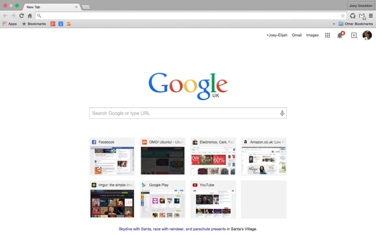
Google Chrome is continuing to receive its Material Design makeover in a piecemeal pattern, little bit by little bit, feature by feature.
Following the promotion of ‘Enhanced Bookmarks‘ to beta channel users, new incognito tab design and a host of minor Material touches to Chrome OS, Google this week flicked the switch on a new Material Design New Tab Page for desktop Chrome users.

Visually it’s nearly identical to its Android counterpart, which got its UI rubdown in September. You’ll find the same squarish carded look, hover effects and colour scheme.
Each website thumbnail/preview is now encased in a box making the overall speed dial area taller and wider than before. To compensate, Chrome has extended the width of the search box.
For now you need to be on the developer channel to see it, and it can be disabled using a flag that has been present in developer builds of Google Chrome for some time (but never worked).
We’re Living In a Material World
Although this latest change is minor, and I can’t foresee any complaints, any change made to the New Tab Page has to be done with great care and grace. As we saw earlier in the year, some Chromies don’t like their browser being messed with.
For comparison, here’s the change in action via super-duper giffery-trickery:
