
Chromium developers seem an impatient sort. They’re always tinkering, toying, testing, trialling and tweaking features, both under and above the hood of Chrome. And y’know what? I love ’em for it.
While the biggest interface change, the experimental and super-minimal ‘Athena’ UI, isn’t available to opt in to, other design experiments are.
Among them is the “Experimental App Launcher”, available to switch on in beta and dev versions of Chrome OS, and Chrome for Windows and Linux.
The easiest game of ‘spot the difference’ ever
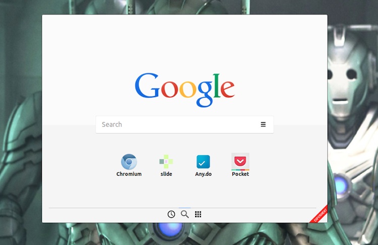
What’s “experimental” about this version of Chrome App Launcher, you ask? Well, for one, it runs in middle of the screen rather than above the click point of the App Launcher icon itself.
The repositioning affords it more room by not having to contend with accidentally overflowing off screen. The result is a wider layout that can show, and potentially do, more.
Features & Flow
Calling the Experimental App Launcher works the same: you either click the gridded icon in your task bar, app shelf or dock or, on Chrome OS, tap the ‘Search’ key.
The vertical paginated grid gives way to a landscape card with centred search box, a handful of app icons and links to additional “pages”.
Searching works as normal. As you type relevant hits sourced from your installed apps, the Chrome Web Store and Google Search appear.
(Incidentally, remember those new handy “suggestions” in Chrome for Android? Support for them will be rolling out here in due course, I’m told.)
Clicking on the “grid” icon opens a page housing links to all of one’s installed apps. The wider layout allows more of these to appear on screen at one time. Folders, right-click actions and the ‘App Info’ dialog remain fully supported.
In a version of the launcher in testing is a third tab (albeit the first one listed) denoted by a ‘clock’ icon. Presumably this will show a list of top sites (i.e., one’s history) though with recent moves towards bridging Android and Chrome OS, it’s possible that this page may also play home to websites open on “other devices”.

“Classic”
Experimental means just that; what I’ve referenced above is all subject to further testing, improvements and change. Is it an improvement over the “classic” app launcher thus far? For me, no.
On a touch device it certainly makes sense as one’s hand will typically retract to a central position after reaching out. The repositioning does cause travel for mouse/trackpad users. You click the app launcher icon on the bottom of the screen and then need to mouse up to the middle.
Hardly a great effort, granted. But it feels a little bit cat-and-mouse after a while.
The new home card launcher certainly serves as a more versatile starting point and clearly has potential. It’s likely that, with those features, especially top sites, it will feel more useful than it does at present.
Want to try it for yourself? Just flick on the ‘Enable Experimental App Launcher’ flag in Chrome and relaunch.