If you’re running the latest beta build of Google Chrome, released last week, you may have noticed that fonts are suddenly looking a whole lot nicer than they used to.
How and why? Chrome 37 Beta is the first release of the browser to default to Microsoft’s DirectWrite technology on Windows.
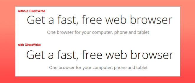
DirectWrite is a text rendering and layout API that was first introduced in Windows 7 and later made available to Windows Vista through an update. Its chief aim is to improve the way fonts in Windows apps look on modern computer screens and support more advanced typographic features, glyphs and unicode characters.
The API also supports subpixel font scaling and ‘prettier antialiasing’ – features that give onscreen text the smooth appearance OS X has long been prized for.
Until now Chrome has relied on the relatively archaic Microsoft GDI+ (Graphics Device Interface), a technology first developed back in the mid-1980s. While suited to the low-resolution displays of the time the advance of sharper, high resolution screens has served to throw light on its shortcomings, most noticeably in scaling and presentation.
A bug requesting that Chrome make use of the (then) new text rendering feature was opened back in 2009. Google says that ‘extensive re-architecting and streamlining of Chrome’s font rendering engine’ was required before the request could be met, adding:
“Some users should begin seeing better-looking fonts and increased rendering performance as we roll out DirectWrite, with no changes required by web developers.”
With the promotion to beta the feature will now get a wider batch of testing and feedback.
If all goes well Google says that DirectWrite support will roll out to all Windows users with the Chrome 37 stable release, due sometime in the coming months.
- Source: Chromium (via Techcrunch)