
Google’s designers have given the Chrome Web Store sidebar a rejig, consolidating many of the filters and categories to make finding apps easier.
The streamlining of navigation options, chiefly in the dropping of collapsible category lists, lends the store a simpler, cleaner structure.
Three simple links sit at the top of the sidebar: Apps, Extensions and Themes.
Depending on the item selected a set of filters will appear beneath.
For example, selecting ‘Apps’ offers choices to filter between two types: ‘Chrome Apps’ (previously listed under ‘for your desktop’) and ‘Websites‘ (new filter).
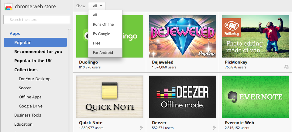
Category options for all content types are now presented in a drop-down menu rather than a (seemingly never ending) set of accordion style lists.
‘Collections’ and other category items with sub-menus are now housed neatly in the drop-down:

The toolbar that previously sat above the main grid with a single, solitary “Show” filter has been removed, and its choices, sans ‘Available for Android’ which is now a category, are located in the sidebar.
-

Old Web Store Sidebar with accordion categories and toolbar menu
The new arrangement of content and filters is as follows:
‘Apps’
- Types: “Chrome Apps” or “Websites”
- Categories: Now listed in a drop-down menu rather than accordion, includes ‘For Android’
- Features: Items previously listed under “Show” in grid view toolbar; drops ‘For Android’
- Ratings: Newly added
‘Extensions’
- Categories (including sub-menus)
- Features
- Ratings
‘Themes’
- Categories
- Ratings
These tweaks aren’t the only ones Google has made to its Web Store recently. Last month the look of app listings themselves was revamped, gaining a new ‘Support’ section and minor layout changes.
Are you a fan? Let us know what changes you’d like to see introduced to the Web Store in the comments below.