
Google is working on a new look for ‘Hosted Apps’ in Chrome OS, one that puts navigational controls directly into the window frame.
Also known as ‘glorified bookmarks’ and ‘URL Apps’, hosted apps are websites and services that can be installed from the Web Store or created through the browser as shortcuts. They have their own app icon on the App Shelf, appear in the App Launcher and open in their own window rather than a new browser tab.
Examples of ‘hosted apps’ include Gmail Offline, Spotify and any website you create yourself through the Menu > Tools > Create Shortcut link.
Hosted apps are not as elegant, seamless or as integrated as regular Chrome Apps, and most cannot work offline. But they serve a purpose in helping bridge the regular web with the web-centric desktop.
Current Experimental New Look Less Than Ideal
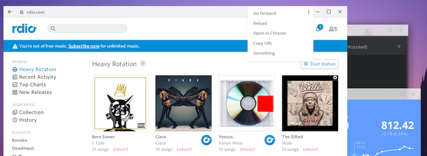
Google has been experimenting with several ways to improve the appearance and navigation of these web-based apps in Chrome OS for a while. In fact, you may have already enabled the ‘streamlined hosted apps‘ flag in Chrome OS yourself.
Toggling the design change on, for all of its well-meaning intentions, ruins the simplicity of the basic, default framed website style, shown below.

How so? By showing the regular Chrome toolbar — the one you see in a regular browser window — in the app, complete with URL bar, extensions and menu. The look is, as one Chromium developer describes it, ‘broken’:
“Seeing the toolbar for streamlined hosted apps is really confusing. It looks more like Chrome is broken and the tabs disappeared than a deliberate option.”
Proposed Material New Look
But the Frankenstein design above may never come to be. Since the public announcement of Material Design many of Googles sites and service have been earmarked for a material makeover. Chrome OS is no exception.
A tentative design proposal for Streamlined Hosted Apps in Chrome OS shows how the simplicity of the default framed approach can be combined with the functionality of the experimental version.
How? By embedding control elements into the window frame itself:
In the mock-up above, which is attached to the Chromium Bug tracking the issue, we can see how this works. The back button, title/URL, padlock/favicon and menu button are embedded directly into the window frame itself. This is not only a great use of (otherwise wasted) space, but it also looks great, too.
Subject to Change, Naturally
There’s no definite word on when the proposed design is going to (excuse the pun) materialise in code, so it may be a while before we can try the natty new window control elements for ourselves.
Things may change between now and whenever that is, of course. But given how fast the Chromium development team is at hammering ideas into working code, I’d wager we have it in our hands sooner rather than later.
Do you like the new look? How would you handle windowed URL apps in Chrome OS?